How to optimize your Sharefox rental site

Step by step – How to optimize your Sharefox rental site
- Front page optimization
- Product optimization
- Image optimization
- Product categories optimization
- Search engine optimization
- How to change SEO meta titles for your rental webshop in Sharefox
Contents
1. Front page optimization
In the digital era, having a well-optimized website is imperative for any business, from International Brands and Organizations to small and medium rental businesses. Technology has made it simpler than ever before to locate businesses, yet that does not negate the significance of maintaining a good website. In the short time your page is viewed by potential customers, you must create a positive impression and convince them to select your service.
Before you start building your front page, you need to understand the market that you are in, your positioning and who your core segment is.
Are you selling B2B or B2C, or both? Try to think about how to make it as easy as possible for customers to navigate through your website.
When you have a great idea for your segment and positioning, then you will be able to design a website with a customer journey that caters to your core segment.
Here are our best tips on how to optimize your Sharefox front page:
- Title
Craft an attention-grabbing headline that succinctly highlights what your rental service has to offer. Don’t forget to incorporate the central keyword associated with your business, as well as the area in which your business is located. Providing this information upfront helps customers quickly identify if they’re in the right place or not.
- Text
To make it easy for customers to use your service, the text on the front page of your website should provide all the necessary information while being concise for mobile usage—get to the point. Here are some ideas of what you can include: What do you sell? Who are you? Where is your business located? How do they access and utilize the services you offer? Is there an option for home delivery or must they pick up their product themselves? Make sure every key detail is included so that visitors have everything they need at a glance.
- Images
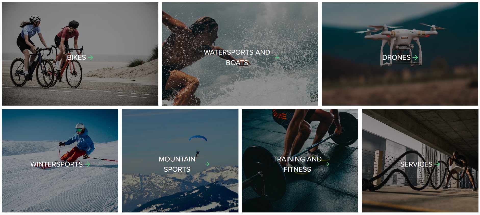
Selecting the right visuals for your business can be a daunting task, yet it is essential for creating an impactful first impression. Unfortunately, many companies fail to realize this and rely on low-quality images that are usually pixelated. If you don’t have access to a professional photographer, consider looking into free resources such as Unsplash or Pixabay which offer stunning visuals perfect for businesses of any size.
- Logo
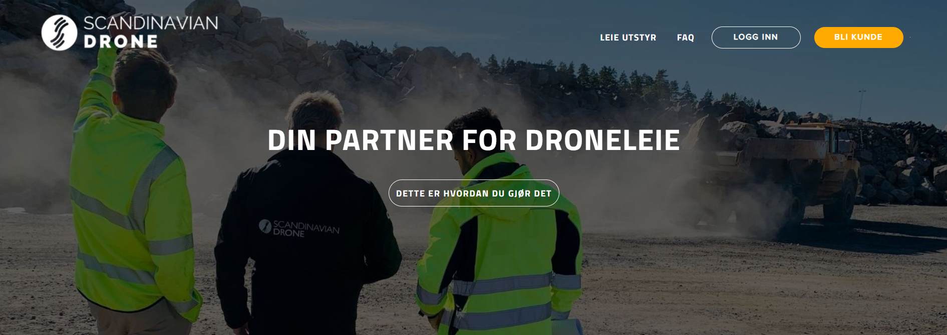
Ensure that the logo you use to represent your business is of excellent quality and visible on whatever background it’s placed upon. If your logo features a light hue, incorporate a darker backdrop; if dark colors are employed in the design, a lighter ground would suffice best. By doing this, you’ll convey an optimal impression to all visitors
- Colors
When selecting colors for your website, always stay true to your brand. However, be mindful that some shades may not appear optimally on digital displays. Additionally, never use white text against a light background or black font against a dark backdrop – both will be difficult to read.
- Contrasts
Make sure your website stands out by utilizing the power of contrast. To create visually engaging websites, designers often utilize contrasting colors in text, buttons, and images to make them stand out. For instance, using a dark color button on a light background creates an impressive visual impact that captures the attention of viewers immediately. Employing such contrasts can be very effective in increasing visibility for your site elements and overall engagement with visitors to your page.


